Six of the Best: F1 ugly ducklings

They say that beauty is in the eye of the beholder, and rarely has the need to try and justify beauty been so essential as with the 2014 class of Formula One cars.
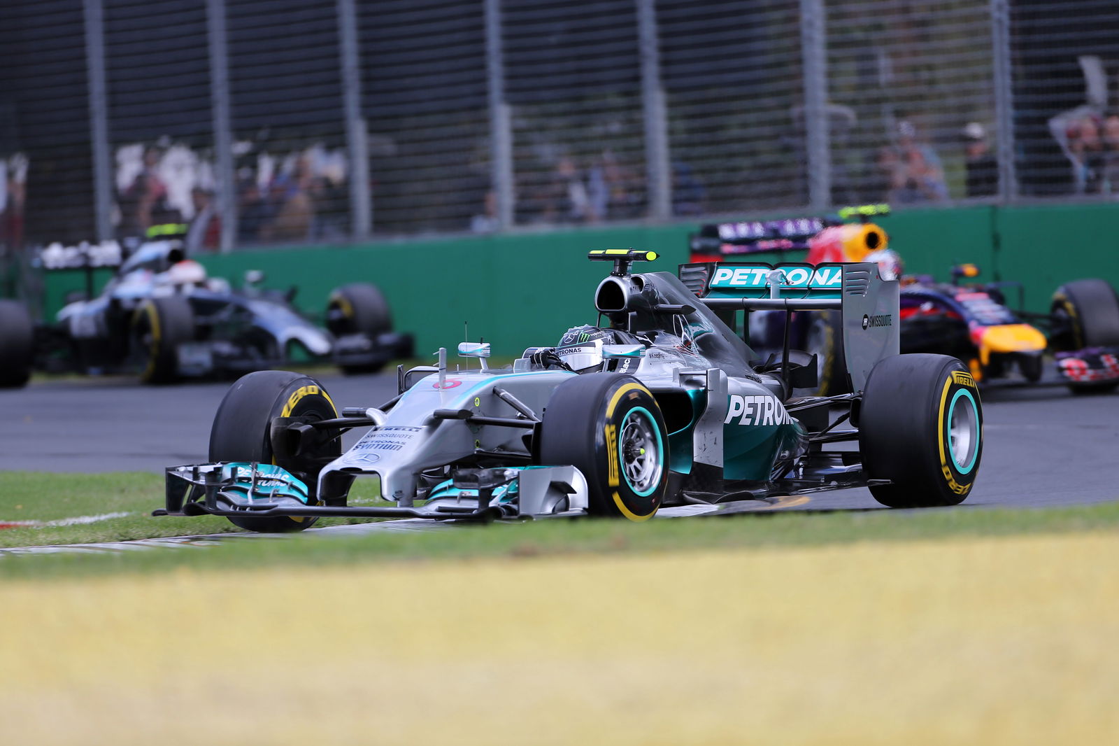
From the duck-billed Caterham CT05 to the pronged-snowplough McLaren MP4-29, and from the sloping shovels of this year's Ferrari and Mercedes to the Gonzo-esque protrusions adorning the new Toro Rosso and Force India cars, 2014 may well go down as one of the least aesthetically pleasing years F1 has ever seen.
Since the early 1980s, ever-more stringent regulations on design introduced to curb spiraling speeds homogenised the appearance of Formula One cars, so much so that inventive deviations such as the X-wing Tyrrell, double-winged McLaren, walrus Williams or rabbit-eared Honda were derided rather than celebrated for their individuality. 2014 at least marks a welcome return to a bygone age of bespoke and identifiable design, where a car's silhouette was sufficient to uniquely mark it from its rivals on the grid.
Throughout history though, some cars, whatever the design context or the unique visual legacy they leave behind, are objectively hideous - and it's to six of Formula One's very worst offenders that we turn the eye or our ire below.
 |
| MARCH 711 - 1971 |
The dawn of the aerodynamic age was a wonderful time to be a Formula One designer. Fixed wings, which had first sprouted on Grand Prix cars in the late 60s, were a godsend to teams and engineers in the quest for downforce, and it soon transpired that they were a source of infinite opportunity for designers with a taste for the theatrical.
Whilst rear wings quickly evolved to a fairly standardised appearance, front wings, due to their crucial aerodynamic position as the first point of contact for airflow over the car, have always leant themselves to more creative solutions - a trend with obvious lineation to this day.
Perhaps the most unique front wing in Formula One history though belonged to the 1971 March 711. Having made an auspicious debut in 1970 with a hastily scrambled together car (albeit one that would take three wins with Jackie Stewart at the wheel), March's first 'proper' effort, with a full pre-season of design behind it, was quite the head turner.
In an effort to create maximum downforce with the wings on the car, Robin Herd, Chief Designer, and Frank Costin, March's Head of Aerodynamics, built what was officially dubbed a 'Spitfire' nose, but became known to all as the 'tea-tray' or 'surfboard'. Essentially a pylon-mounted flat board at the front of the fat, round nose section, the wing appears to have been stuck on upside-down by today's standards.
Scarlet red and embossed with white STP branding, the wing was an incredible piece of advertising space, but appeared to have limited practical use and was soon discarded from the car. It remained indelibly in the public's imagination though, and clearly didn't impact the team's season too drastically - with Ronnie Peterson charging to second place in the 1971 drivers' championship.
 |
| LIGIER JS5 - 1976 |
Some proofs are just too well evidenced to ignore. Gravity, for example. Or the understanding that (What's the Story) Morning Glory? is a much better album than Definitely Maybe. From an F1 perspective, there can be no debate about the sport's most unintentionally hilarious monstrosity: the 1976 Ligier JS5.
As with March's 711, the Ligier JS5, the French marque's first F1 entrant, embellished a particular element of the car's design to a point of almost cartoonish parody. In the case of Ligier, that feature was the airbox - bulbously ballooned to comic proportions - leading to the JS5 universally being dubbed 'The Teapot'.
High airboxes were a peculiarly 70s fad, with virtually all teams employing grilles of teetering skyscrapers above the driver's head in the name of improved airflow to the engine. Whereas most teams went tall and thin, Ligier rounded out the edges of the airbox and engine cover to create a plump visual style for which 'teapot' was the only natural adjective.
In a grid of high-risers (not to mention the six-wheeled Tyrrell P34), the Ligier JS5 still stood out a mile. As with many of F1's most striking innovations, bold turned out to be neither beautiful nor particularly quick.
Once converted to a more subtle airbox configuration mid-season, the JS6 proved to be quite rapid - taking three podiums and a pole position for Jacques Laffite at Monza. Frankly though, the Ligier JS5 could have won every race and the prevailing memory would still be of the sight of its remarkable teapot spout. Sometimes, less really is more.
 |
| ARROWS A2 - 1979 |
The breakthrough of 'ground-effect' in the late 1970s was one of Formula One's most dizzying, and dangerous, discoveries. Not only did it create perilously high cornering speeds for cars that were 'sucked' towards the ground, it also opened up whole new realms of possibility for designers in the quest for downforce.
The Arrows team had made its F1 debut in 1978, founded on the strong pedigree of former Shadow personnel - among them Jackie Oliver and designers Dave Wass and Tony Southgate. Their first effort, the conventional A1, had had a respectable maiden campaign, delivering 11 points and 10th place in the constructors' championship.
For year two however, the team decided to go radical. The aim of the A2 was to create a car that was effectively one giant wing, setting the engine at a four degree angle to maximize the 'wedge' shape of the chassis, and doing away entirely with front and rear wings in favour of downforce generated solely via the sidepods.
The results were hideous. The wing-less nose looked like a turtle's tail protruding from under a vast golden shell, with the unusually thick straight line suspension, combined with the high-top moonage daydream wing mirrors and ominously looming giant rear tyres giving the car something of a Mad Max style menace. The all-gold Warsteiner livery, in itself an abomination, was actually the least of the A2's aesthetic problems.
Performance-wise, the A2's drastically variable handling, caused by the effects of changing ground clearance over bumps reducing the effectiveness of the car's ground effect, rendered the wingless wonder something of a damp squib. A rear wing was swiftly bolted on, and by mid-season the A2 had been abandoned altogether in favour of the tried and trusted A1 model.
 |
| FERRARI 312T5 - 1980 |
Given Ferrari's enduring reputation as a purveyor of stylistic beauty, it's almost sacrosanct to include one of the Maranello's machines on this list - but it's impossible to ignore the hideous 1980 312T5.
The 312T series had been on the grid for 5 years - undergoing many superficial adjustments but retaining the same core DNA under its shell. As defending drivers' and constructors' champions, Ferrari were confident that the 312T5 could build on the success of 1979's title-winning 312T4.
The car was an unmitigated disaster however - both from a visual and a sporting perspective. The 312T5 was a vastly bloated, scarlet dining table of a machine, almost crab-like in its skittish low-profile and adorned with what looked like aluminium ironing boards for wings - the front of which was upturned in a less drastic interpretation of the March 'surfboard' style.
The width of the car, necessary to incorporate the powerful 312 'Boxer' engine, naturally engendered a lack of aerodynamic flexibility. This trait would prove Ferrari's undoing as the less powerful Cosworth-engined teams developed much more sophisticated aerodynamics to compensate for their lack of grunt.
Results were feeble, with Jody Scheckter's title defence amounting to just two points scored and an early retirement at the end of the campaign, and Gilles Villeneuve faring little better with a haul of just 6 points.
The car's failure would see the end of the 312 era, with Ferrari rolling out a completely new car, the slightly less truck-like 126CK, for the 1981 season. Despite stiff competition from the 1996 F310, by virtue of the combination of feeble performance and brutal modernist aesthetic the 312T5 pips the post as Ferrari's ugliest ever F1 entrant.
 |
| BRABHAM BT06B - 1992 |
There are few things in sport as sad as the terminal decline of a once pre-eminent power. The 1990s proved a dismal decade for Formula One's grandee privateers, as one by one the names of Lotus, Ligier and Tyrrell vanished from the grid.
Also on this list were Brabham, World Champions in 1983 with Nelson Piquet, liquidated mid-season in 1992. It was a startlingly rapid decline, and sadly concluded with one of the all-time most hideous F1 cars.
The 1992 BT60B was a modified version of the BT60Y, which has scored three points in 1991 with the 'Brundell brothers', Martin Brundle and Mark Blundell, behind the wheel. The car may have retained its previous incarnation's distinctively horrid 'bullet' nose - a globular rounded front chassis that culminated in a sharply protruding tip - but it was all change elsewhere.
Out went the Brundells, in came Eric van de Poele and F1's last female entrant, Giovanni Amati. Out went Yamaha V12 power, in came a Judd V10, hurriedly bolted in to the back of the car. And, 8 races into the season, out went Brabham's classic dark navy and white colours, and in came a shocking pink, navy and electric blue livery.
Selling a team's soul out of desperation in financial dire straits is one thing, but sacrificing it for such a hideous paint job as Brabham did was a middle finger to almost 30 years of proud racing heritage.
Also gone by early summer was Amati, hopelessly out of her depth and replaced with Williams test driver, Damon Hill. Hill would secure Brabham's final two race starts at the British and Hungarian GPs - and therefore would have the dubious honour of being the only driver to enter a race for Brabham with the ghastly pink paint-job before the debt-ridden outfit collapsed into ignominious ruin.
 |
| BAR 01 SUPERTEC |
With no new teams having entered Formula One since 2010, it's been over four years since we've heard the excitable blend of bombast, wild over-optimism and respectful caution that usually accompanies the arrival of a new kid on the block.
When BAR entered Formula One in 1999, there was certainly no shortage of misplaced hype and over-eager posturing. The team's bravado extended to hiring 1997 World Champion Jacques Villeneuve, designer Adrian Reynard's assertion that the team could take pole position and win their very first race, and the comically misjudged team slogan, 'A tradition of excellence' - a bizarre claim for a startup outfit.
BAR's swaggering entrance to the paddock also extended to their unique 'zipped' livery. There was a method to the madness, with the British American Tobacco-owned effort keen to split promotion for two of their cigarette brands, Lucky Strike and 555, across the two cars. However, the FIA rules dictated that both cars had to have the same liveries. Thus, BAR decided to create F1's first, and up to now last, dual livery.
The design included a grey area around the front wing underneath the 'zipper', into which the team's other sponsors were hurriedly cluttered, whilst the zip itself ran up the centre front of the chassis away from the nose - splitting the car into the white and red of Lucky Strike and the blue and yellow of 555.
It was a childishly hideous concoction, and whilst an ugly and victorious car may still be described as beautiful, the performance of the BAR 01 went hand-in-hand with its appearance. The 'zipped' car failed to score a single point, and the dual livery was quietly dropped in favour of more traditional racing colours from 2000.


